There are over 500,000+ fonts and typefaces in the world, whereas, a lot of business owners and designers always fall victim to repetitiveness. Often by using the same common and good old standard fonts that have been used on a day-to-day basis.
There are certain rules about fonts when you are working either on your company branding style or working on a company logo or even writing a blog that should be used or not to be used.
Top Overused Fonts
If you are designing a logo, branding your company or writing a blog and you want to stand out from the crowd and attract attention, you will find below in this article some information on several typefaces to avoid hence they are regularly used on a day-to-day basis. This will help you make some decisions that would make your work more creative and captivating.
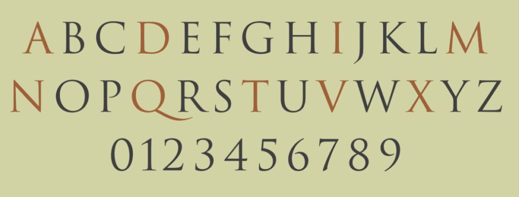
Times New Roman
This font came from the British newspaper; the Times of London. It has been a default font in Microsoft word for so many years and due to its usage in a daily newspaper, it became a favourite of most printers. Even as typesetting devices have evolved, the popular font has remained the same. However, because of its popularity in the academic space, this font shouldn’t be your option for design or writing as it is regarded as the most overused typeface.

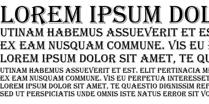
ALGERIAN
The Algerian was designed in 1988 by Phillip Kelly to decorate works related to the Victorian era. It has been a favourite for designers who create design works for movie credits, restaurants, sports, and so much more. But it has been overused and should be avoided.
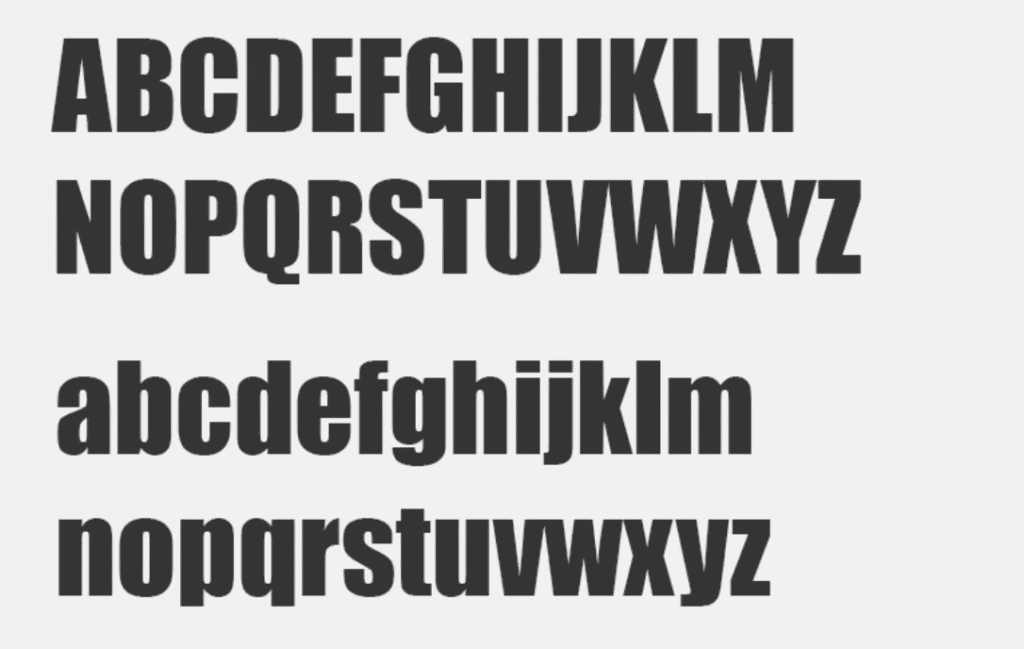
Impact
This font is a sans serif family typeface that is accepted worldwide and has also been overused mostly in headlines, logos, billboards and posters, it is however not used in body texts due to its boldness. The font was designed in the 1960s by Geoffrey Lee who wanted to make an “impact” which is the case today. But this typeface has become overused by graphic designers, academia, and so many more. It should be avoided just the same way as Times New Roman, it is easily spotted when used for writing, designs and whatsoever.
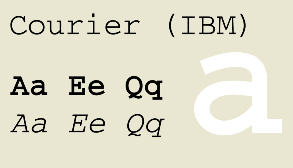
Courier New
This font was initially designed for typewriters, it is another family font that is also on the overused list. This font has an improperly measured litter making designers and branding agencies avoid it. It is also unsuitable for consumers due to its low resolution. This portrays an outdated ancient design. There are alternatives to this font so this should be avoided too.
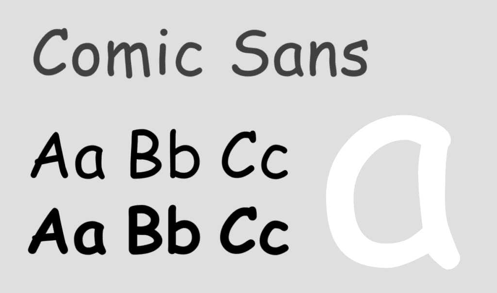
Comic Sans
Comic Sans is a very popular font that has been used over time for designs, being it party invitations, cards e.t.c. This isn’t your regular professional typeface. It looks childish and has no room in a professional working environment. It can however be used in a preschool setting. It is preferable for use on children’s products. At some point in time, there were some moves to ban Comic Sans, this is to show how much this font has been on an unwanted list. Besides being unprofessional, it is one of the most common and undesired fonts that you’d want to stay away from.
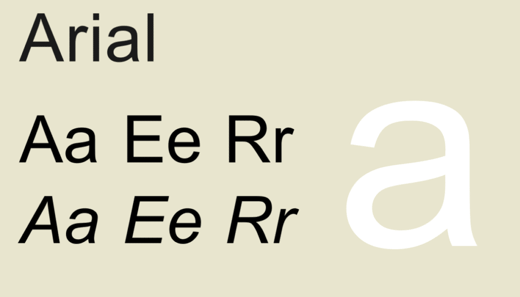
Arial
Arial has been a default font for Microsoft applications for so many years until the coming limelight of the Calibri font which replaced it in Office 2007. Before this time, Arial was the most preferred alternative to Times New Roman. This Iconic font gradually became a victim of overuse from publications to website designs and for so many other uses. It should no longer be a font of choice.
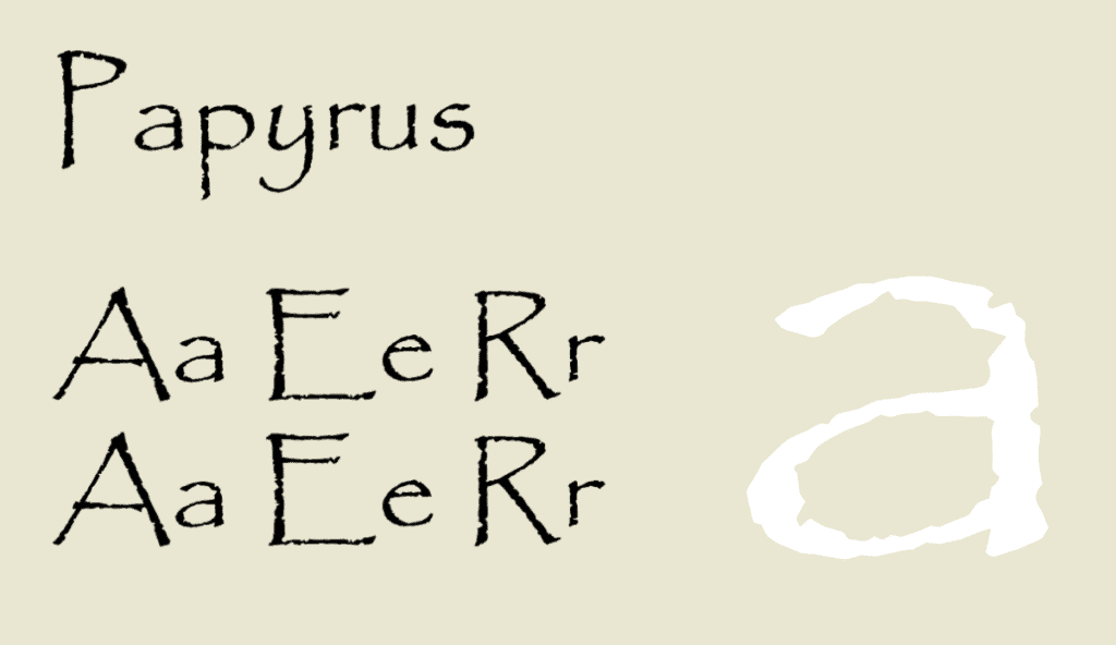
Papyrus
Papyrus font has been viewed as a poor-quality font and ugly typography. With this, it deserves to be pointed out like an overused font. Some blogs have highlighted Papyrus as a misused font making it one of the fonts to avoid using at all costs, particularly in a business landscape. Although it is not suitable for business or corporate projects, it is great for posters, banners, event cards, gift cards, menus etc.
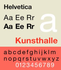
Helvetica
This is one of the best typefaces and beautiful sans serif font families. To some good effect, it has been widely used by most established businesses and Apple is one of them. Helvetica also has some legibility concerns, especially for persons with weak eyesight. This font is not just an overused font but also an awful font because of its readability and legibility making it lose its old disparity. It has consequently become a very common typeface and should no longer be used for creativity in any way.
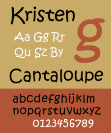
Kristen ITC
This font can be fun to be used for classroom signs for preschoolers but using it in the business world is not a great idea. You would not want your logo to be reading in this font making it look like something written by a toddler. It is very difficult to space the letters effectively due to the curved style of the words. This font has also been overused and should be avoided because users will always figure it out easily.
Trajan
This font is of Roman architecture and has always and mostly been used on movie posters and other film marketing products. It has been loved by designers and movie illustrators. Trajan font can fit in most official occasions and is mostly accepted as a professional font. Even as it is a beautiful font being used for epics and entertainment, Trajan is another overused font that has been used mostly in films. Unless there is a call for it, it should be avoided.
Bradley Hand
This font is another overused font that has lost the glory it once had. In the past, this font was used in most storybooks, invitations and school notices.
Bradley Hand has this humanized look and feel of a digital text. Even though it is not the worst font in the world, there are many better alternatives to consider when picking a font.
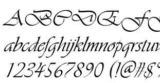
Vivaldi
At first glance, this can be considered a nice font but the longer you look at it, it gets worse. This has been a very popular font and has equally been overused. The spacing of the letters is not ideal which makes it worse. Writing in all caps with a Vivaldi font is not advisable because it creates a great mess. Whatever you are creating be it an invitation or a business card do not try to use the font to make it fancy because you will end up making a mess.
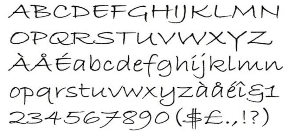
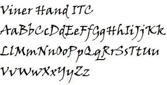
Viner Hand
Viner Hand is another overused font that has lost any impact it once had. This font looks nice and like a real handwriting style but it has overfilled with youth-focused areas which have made it a font to avoid. It is however not the worst font on the list but there are other better choices out there. So, as a designer, you need to avoid this typeface and focus on the newer options available.
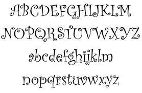
CURLZ MT
The Curls MT font was designed by Steve Matteson & Carl Crossgrove in 1995 with a bent and twisted metal look. The designers pictured it could be used for menus, carefree and productive titles, greeting cards and so much more. This is not the type of font you use for corporate styling or clear or readable messages due to its curly effect. But it is a great font for restaurants, bars, event cards etc.
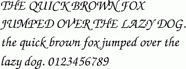
ZAPF CHANCERY
Hermann Zapf designed this font in the 1970s which was based on the Italian Renaissance Chancery handwriting. It was adopted by Apple for its LaserWriter printer in the early 80s but today, it is one of the most used typefaces used on both Mac and Windows devices by many designers and users. This font used to be the best at some point in time but today, there are other amazing fonts one can explore for personal or commercial projects.
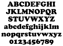
COOPER BLACK
This font was designed in 1921 by Oswald Bruce Cooper an American graphic and typeface designer which was then brought out under the Barnhart Brothers & Spindler foundry. The designer is known to have contributed to the course with many other typefaces such as the Cooper black series, Cooper series, Cooper full-face series and so much more. The font has been used for years by so many designers for businesses, signs, etc. As such, has been overused and as a modern-day designer, you have other fonts to explore.
CONCLUSION
When handling your next project, stay away from these overused fonts, and most importantly, you should avoid fonts used in Microsoft built-in for your designs. If you want to be taken seriously, you need to take time not to abuse one of these fonts, lest it portrays your brand inappropriately.
The good news is that our branding agency can always help craft a unique and captivating font that’s relevant to your business and industry. If you need any help with branding services, you can reach out to us for a free consultation. We’ll be glad to assist.
Thank you for sharing the most used fonts all over the world. This is such great knowledge and its increased my experience. Kristen ITC is a much useful handwritten font and I really like this amazing font.
Thanks.